This last year marks the bicentenary of the publication Manuale tipografico by Giambattista Bodoni, leading to the organisation of an exhibition and study day supported by the Museo Bodaniano di Parma. As is known, Bodoni’s widow, who intended to finish the project that had been so greatly thought about but only lately started by her husband, published the manual posthumously. The collection brings 665 alphabets and a series of around 1300 different designs, as well as a preface in which Bodoni explains some of his method criteria related to his way of working. An earlier collection of characters does exist, printed by Bodoni in 1788, which does not include a preface or any other type of explicative text, and which was also named Manuale tipografico. Evidently, the Parmesan typographer borrowed the term from the small technical manual published in 1764, the Manuel typographique, by Fournier. Despite having the same title, the two volumes express two different objects and functions. Fournier’s work, indeed, was a true manual in the sense that it was a didactic instrument that described the essential elements of a complex practice, from the cutting of the stamps, to the impression of the mould, and to the fusion of the moveable characters. Bodoni’s version, on the other hand, is a collection of character samples and decorations created by himself. The 1818 Manuale tipografico is different again: it is a mix which, despite its name, belongs neither to the category of manuals, nor to the collection of character samples.
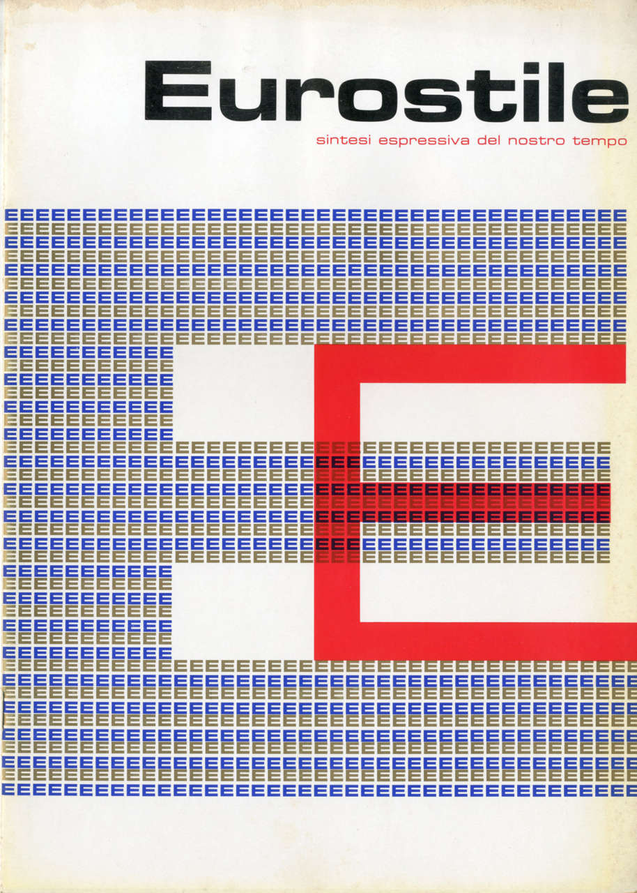
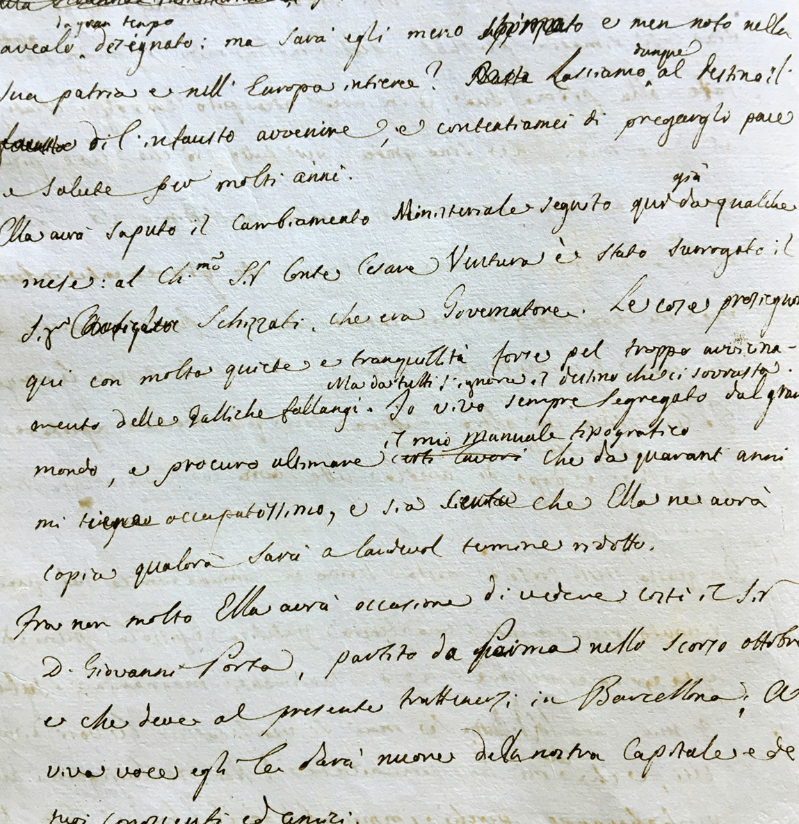
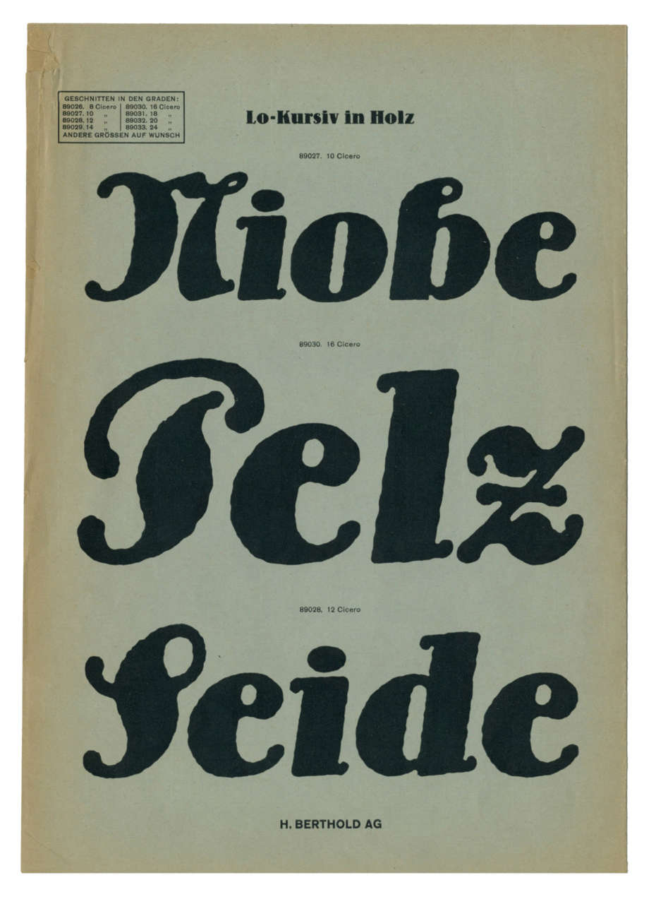
We find ourselves, rather, with a monumental summary of Bodoni’s own activity that he would like to fix in time, putting it down in black and white. Taking inspiration from these premises, we have chosen to display some other manuals and character sample collections by other authors (dating from both before and after 1818) alongside Bodoni’s volumes, his stamps and his moulds, his manuscript studies, and his archived documents, in order to show and illustrate these two very distinct and little-known types of books to a less specialised public. What they have in common is the object of their narration, that is, alphabetic writing in its typographical form: a form of writing that has gained so much weight in western culture during its spreading in the last five centuries. Simultaneously, a part of the exhibition is dedicated to today.
A selected group of international graphic designers contributed to the creation of Manifesto tipografico. The purpose of this part of the exhibition is to be able to visually recognise the concepts which surround the potential of writing expressed by designers who themselves recognise this marked and conscious attitude towards typography. If the manifesto can also be defined as a programmatic document which shows inspiring rules and principles, we find ourselves in the particular situation in which the treated object and its form coincide, as do author and designer. Therefore they are exemplary signs: visual testimonies which allow us to trace the evolution of the form of characters through the very development of our history, and to take advantage of the opportunity to start new critical discourses around the theme of writing as an instrument of knowledge.


